We built a tool to visualize network latency measured with RIPE Atlas.
If you are looking for services such as IP-transit, MPLS channels or DDoS mitigation you can choose from a variety of products. However, it is difficult to compare offers and companies regarding actual service quality. Some organizations compare market offers, but often they look at the market share or the company’s financial condition and other business metrics that are not necessarily relevant to the quality of a service per se. Also, most of these comparisons are not available free of charge.
Fortunately, the situation is changing. Recently we have been given an opportunity to create global scale measurements with services such as PlanetLab, NLNOG RINGand, of course, RIPE Atlas. RIPE Atlas has become the biggest measurement platform, with a rich API as the primary user interface. However, an output of API requests is not always human-readable; it still requires a set of tools on top of the API, to make data easily understandable. So we decided to work on a fix.
Visualising Latency
The Qrator.Radar team developed a set of tools that include several typical experiments, with the focus on visualizing latency maps and DNS output. We wanted to create an out-of-the-box tool and avoid some limitations at the same time (such as the limitation that only allows you to use 1,000 RIPE Atlas probes per measurement). At the moment the tool contains the following parts:
- RIPE Atlas heat map: draws a latency heat map for a specified target
- RIPE Atlas country map: draws an average latency for a specified target of selected countries
- RIPE Atlas nslookup map: visualization tool for DNS output
- RIPE Atlas reachability: a diagnostic tool that measures the availability of specified targets and, besides that, collects traceroutes from probes that didn’t get the echo-reply
There are few additional flags. A full description and the source code can be found on our GitHub repo. The tool is easy to install and to use. All you need is RIPE Atlas credits.
To demonstrate the capabilities of this toolkit, we anonymously compared four global (as specified in their marketing materials) DDoS-mitigation providers. In all experiments, only the main page of a given provider’s website was measured. Primarily we were comparing network delays.
Why is it important to compare DDoS-mitigation services in this particular manner?
Historically, DDoS-mitigation services were created as on-demand services or hardware, online precisely at the time of the attack. However, for many high-risk and high-margin services, the constant switching of the “On” and “Off” states still leads to temporary inaccessibility. As a result, to avoid downtime, such services are gradually moving to a constant and continuous traffic filtering model, instead of on-demand activation. That imposes additional requirements on low latency across the network. According to recent Akamai research, people react to bad video quality and buffering issues, which are connected to network latency. Pings affect online games and gamers, making it impossible to play competitively. Network latency even affects how we search and make search-based decisions on the Web. Those additional milliseconds can have a significant impact.
Measurement Results
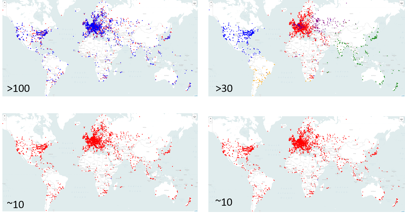
The first DDoS mitigation company we measured claims, on its website, that its network contains more than 100 PoPs. The figure below looks great: the global delays are rather low (green = low latency; red = high latency).
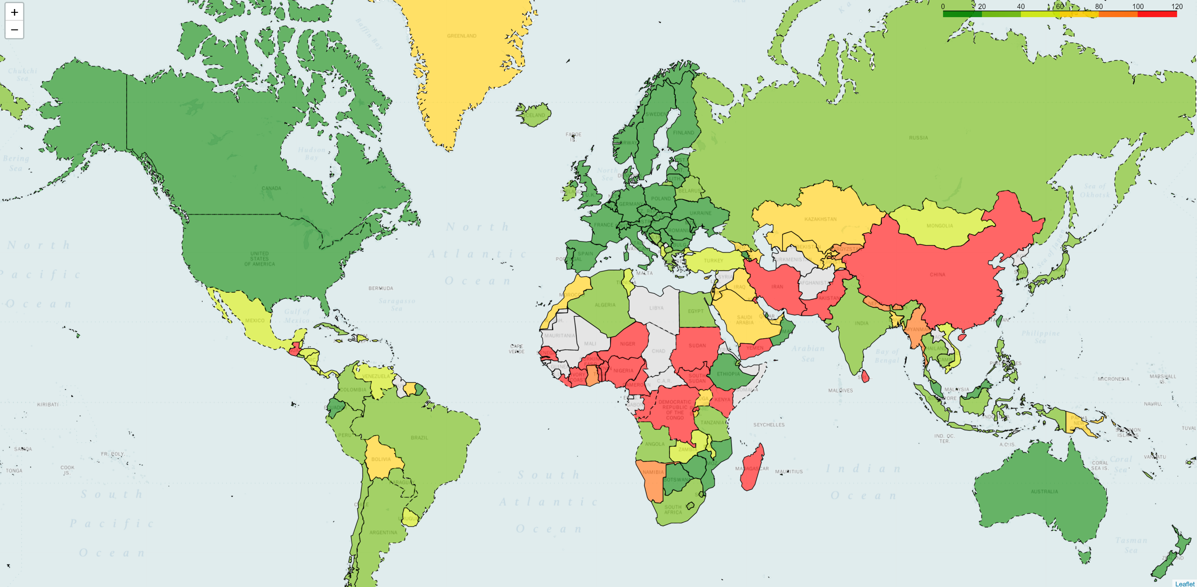
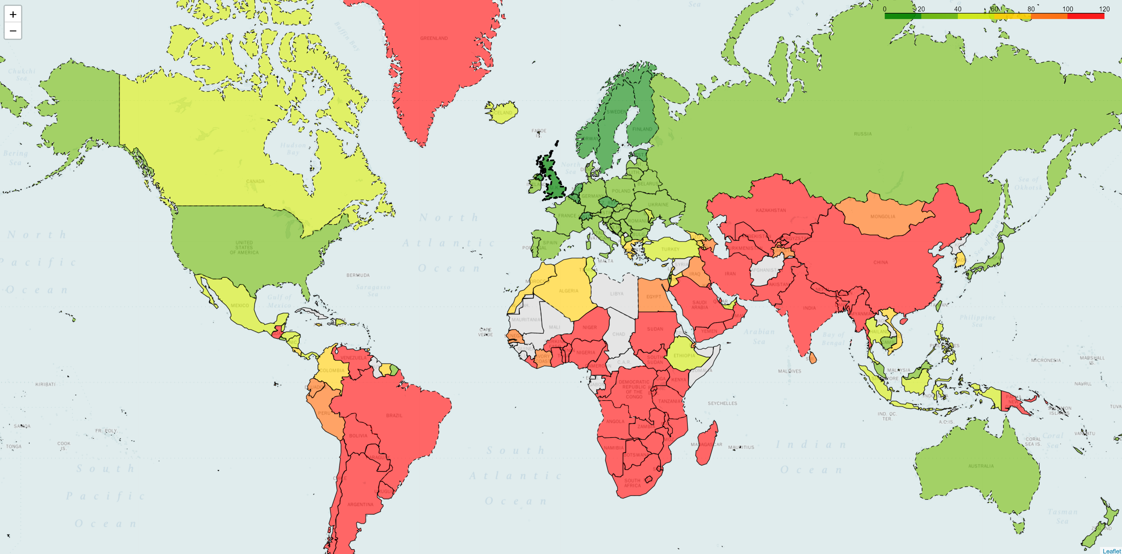
Figure 2 below shows results for a company that has almost 40 points of presence. As you can see latency is high in several regions (those in red).
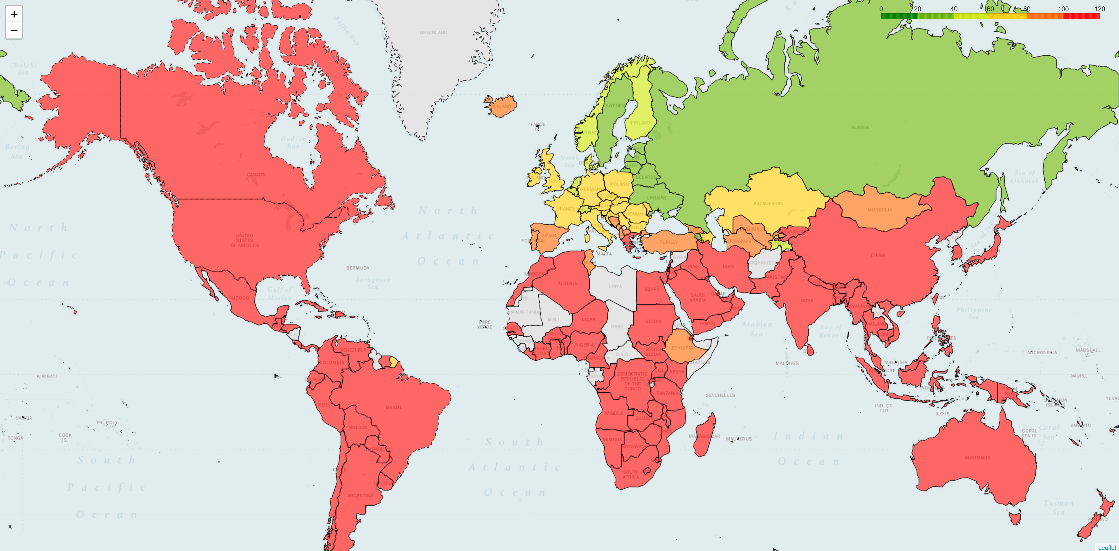
Next, we measured a company with only 10 PoPs worldwide. It immediately changes the latency picture, showing high delays in most parts of the world.
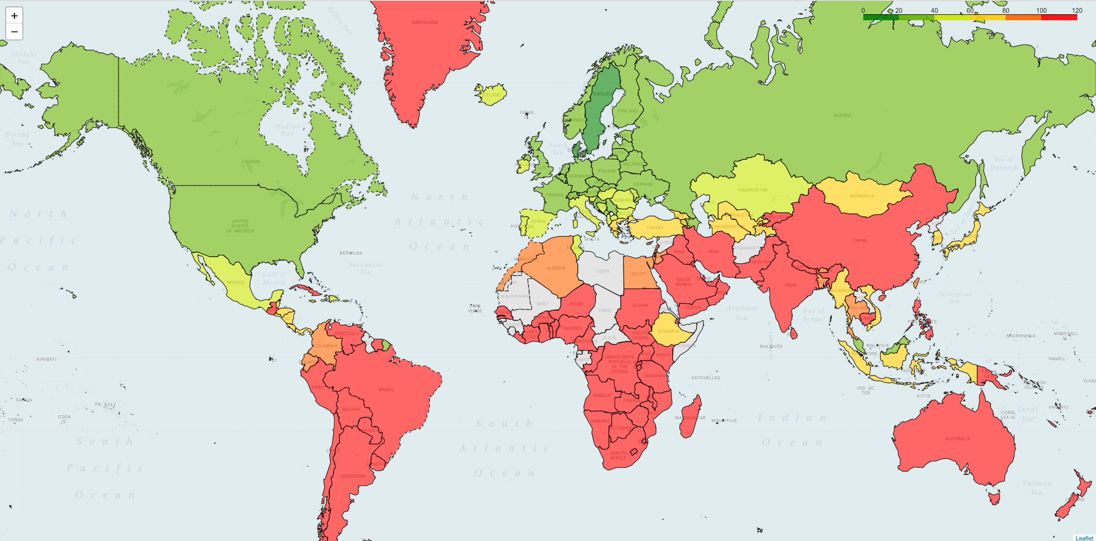
However, if we look at another service provider that also has 10 points of presence, we see a much better picture.
DNS Output
The number of PoPs and their geolocation has a strong influence on the quality of the service. However, this only criterion is not a silver bullet. Delays in networks with the same number of points of presence can produce completely different results, as a network with a smaller presence could still have low network delays in a given region. Let’s look at these competitors from a different angle: How can DNS output be used when comparing DDoS-mitigation providers?
The maps in Figure 5 shows the output of IP lookup, where different colors correspond to different IP addresses. From that, we can quickly detect that the two operators on top are using DNS balancing as the traffic engineering mechanism. Why is that important? Both BGP anycast and GeoDNS have the same goal of keeping traffic local and, as a result, reducing RTT time for end users.
GeoDNS traffic balancing is very popular among CDN providers. In comparison to BGP anycast, a GeoDNS system is accessible to design and maintain, and there is a set of ready to use DNS-servers, while a global BGP anycast network is still a piece of art. Nevertheless, what applies to CDNs is not always applicable to DDoS mitigation. Unlike regular users, bots can merely ignore the resolver of a local DNS server and might therefore easily concentrate its load on a dedicated region or PoP, eventually resulting in disrupting geo-distributed networks piece-by-piece.
Conclusion
This example shows how the RIPE Atlas API, combined with a humanly readable visualization could be used to get better insights into the quality of service for a particular service provider. We hope that the community finds other use cases so that we can extend this toolset. This will hopefully help to increase transparency within the ISP market.